Introduction
According to Gary Simon, there are 7 UI Design Fundamental that has to be met
These 7 fundamentals were heavily inspired by Design Course - The 2020 UI Design Fundamentals Crash Course
The 7 UI Design Fundamentals are:
- Whitespace
- Alignment
- Contrast
- Scale
- Typography
- Color
- Visual Hierarchy
I will give you some ilustrations to elaborate on,
1. White Space
By having enough whitespace, our design will not be crowded. We need to give enough breathing room to our design.

Give enough padding and margin to your design, also make sure that you give consistent number on them.
2. Alignment
Alignment means that your design aligns perfectly. By using this fundamental, your design will look more neat and natural.
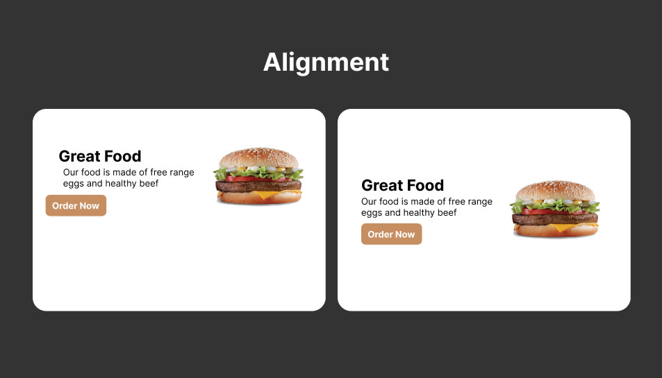
Usually, when developing, we can add a container to give constrained space by using max-width
Example:
<section>
  <div class="container"></div>
</section>

<style>
    .container {
      <!-- Width can also changed with padding -->
      width: 90%;

      max-width: 50rem;
      margin-left: auto;
      margin-right: auto;
    }

  .section {
    <!-- you can add background color here -->
  }
</style>
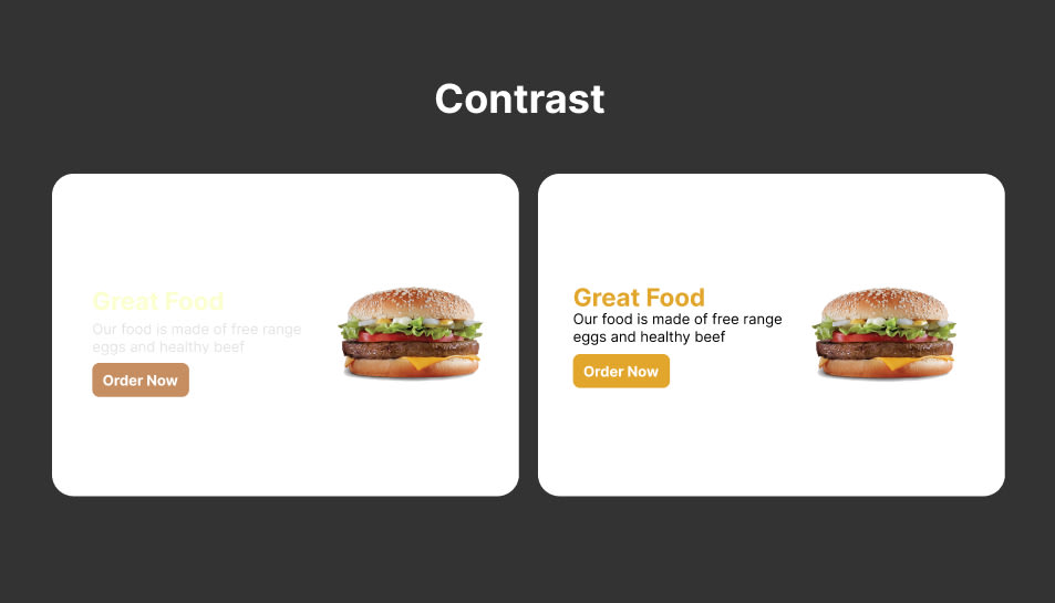
3. Contrast
Contrast is the color difference between text and the background. You need to have enough contrast so it will be easier to read. Contrast needs to meet WCAG 2.0 rules, you can use this tool to check the WCAG. There is also a figma extension which is A11y - color contrast checker.
Fun fact: A11y stands for Accessibility, 11 was taken from letters between A and y.
4. Scale
Scale is the font-size that you use. Choose a font-size that is not too big and not too small. The default is 16px. Contrast and Scale plays a big role in WCAG 2.0 rules.
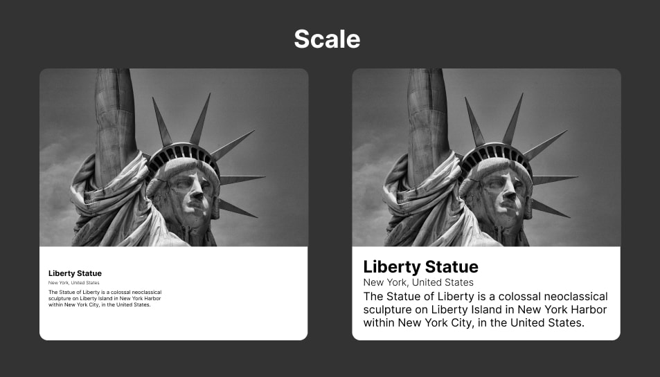
Don't make them squint

5. Typography
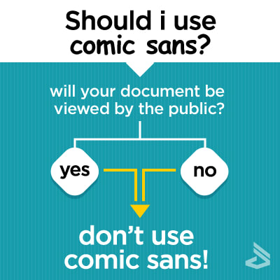
Typography is the font-family that we choose. Don't use too much font, usually, I only use 1 or 2 fonts. Use fonts that can complement each other
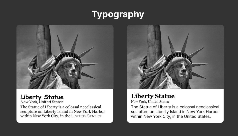
Pro tip: Don't use comic sans ;)
6. Color
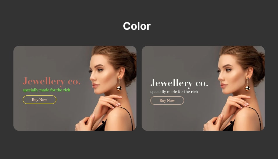
The color you choose for your website will affect the design looks. Don't use too much color. There are some design system that recommends using 3 colors which are primary, secondary, and accent color.
You can also use a website that gives you color recommendation like mycolor.space and coolors
7. Visual Hierarchy
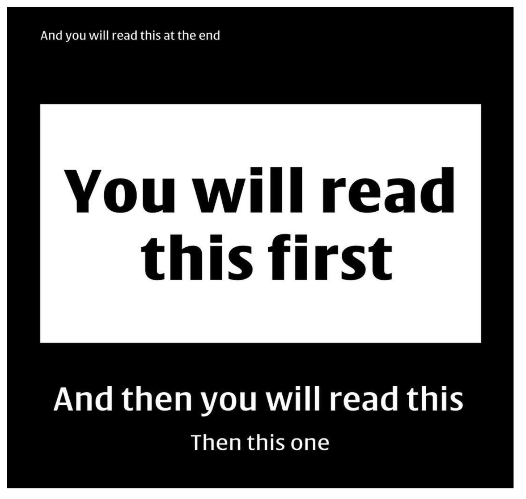
Visual Hierarchy is very important to direct the eye of the user to the flow of the website that you want to make. Give a bigger font-size if you want them to see it first.

User of a website didn't really read, they skim.
Summary
There it is the 7 UI Design Fundamental, hopefully, this blog can make your design improve!


